
Ward Valley
Challenge Yourself
Industry
Wine
Year
2018
Deliverables
Brand Strategy & Identity
Packaging
Brand Photography
Social & Marketing Assets
Ward Valley sits on Marlborough’s southern frontier: a wild, untamed landscape where altitude, dry air, temperature extremes and deep clay create wines of rare intensity. We created a story, identity and packaging system that captures this terroir and the resolve required to cultivate it. An expression of a place, shaped by the land and people brave enough to work it.
Ward Valley
Challenge Yourself
Industry
Wine
Year
2018
Deliverables
Brand Strategy & Identity
Packaging
Brand Photography
Social & Marketing Assets
Ward Valley sits on Marlborough’s southern frontier: a wild, untamed landscape where altitude, dry air, temperature extremes and deep clay create wines of rare intensity. We created a story, identity and packaging system that captures this terroir and the resolve required to cultivate it. An expression of a place, shaped by the land and people brave enough to work it.
Ward Valley
Challenge Yourself
Industry
Wine
Year
2018
Deliverables
Brand Strategy & Identity
Packaging
Brand Photography
Social & Marketing Assets
Ward Valley sits on Marlborough’s southern frontier: a wild, untamed landscape where altitude, dry air, temperature extremes and deep clay create wines of rare intensity. We created a story, identity and packaging system that captures this terroir and the resolve required to cultivate it. An expression of a place, shaped by the land and people brave enough to work it.
View project info
Ward Valley
Challenge Yourself

Brand Strategy
Our strategy positioned Ward Valley as a special place within a special place: the untamed edge of Marlborough. Rather than soften its conditions, we made them the source of distinction. The story celebrates the tension between adversity and reward, connecting each wine’s character to the land and people behind it.
Brand Strategy
Our strategy positioned Ward Valley as a special place within a special place: the untamed edge of Marlborough. Rather than soften its conditions, we made them the source of distinction. The story celebrates the tension between adversity and reward, connecting each wine’s character to the land and people behind it.
Brand Strategy
Our strategy positioned Ward Valley as a special place within a special place: the untamed edge of Marlborough. Rather than soften its conditions, we made them the source of distinction. The story celebrates the tension between adversity and reward, connecting each wine’s character to the land and people behind it.
Brand Strategy
Our strategy positioned Ward Valley as a special place within a special place: the untamed edge of Marlborough. Rather than soften its conditions, we made them the source of distinction. The story celebrates the tension between adversity and reward, connecting each wine’s character to the land and people behind it.

Brand Identity & Packaging
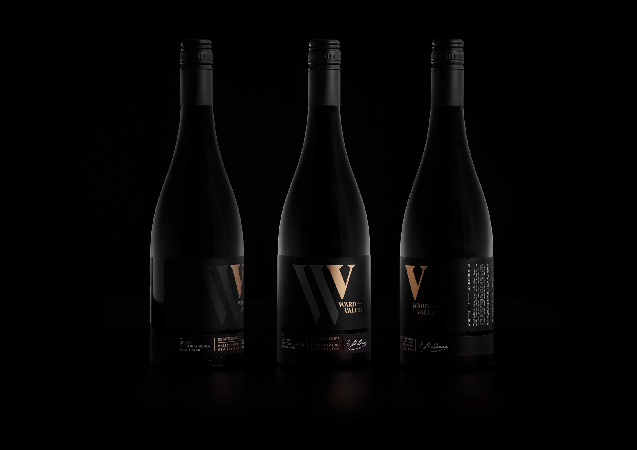
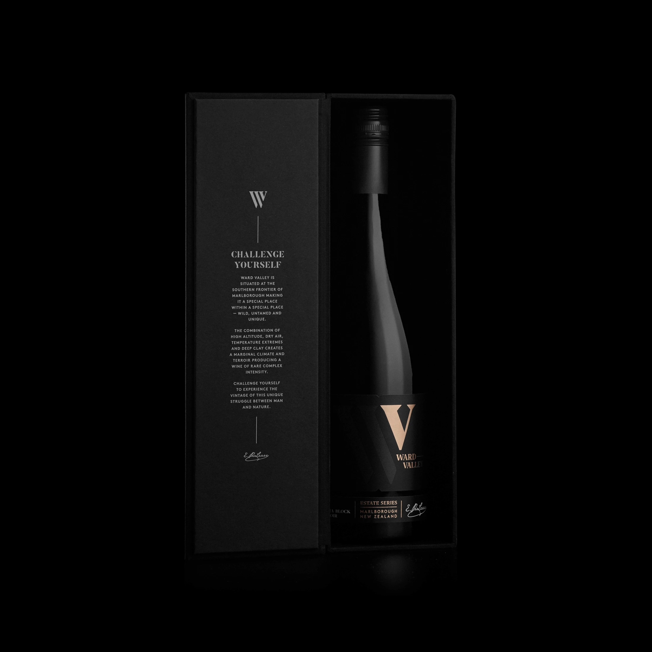
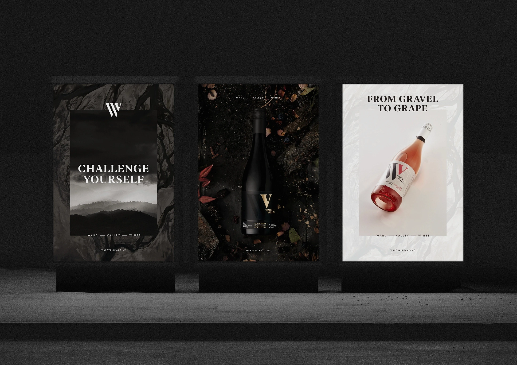
The identity translates Ward Valley’s raw character into a refined, premium expression. A monogram, restrained typography and dark, layered packaging convey depth, rarity and intensity. Rich, textural photography brings the vineyard’s elemental landscape into view, creating a cohesive system that feels sophisticated, uncompromising and grounded in its place of origin.
Brand Identity & Packaging
The identity translates Ward Valley’s raw character into a refined, premium expression. A monogram, restrained typography and dark, layered packaging convey depth, rarity and intensity. Rich, textural photography brings the vineyard’s elemental landscape into view, creating a cohesive system that feels sophisticated, uncompromising and grounded in its place of origin.
Brand Identity & Packaging
The identity translates Ward Valley’s raw character into a refined, premium expression. A monogram, restrained typography and dark, layered packaging convey depth, rarity and intensity. Rich, textural photography brings the vineyard’s elemental landscape into view, creating a cohesive system that feels sophisticated, uncompromising and grounded in its place of origin.
Brand Identity & Packaging
The identity translates Ward Valley’s raw character into a refined, premium expression. A monogram, restrained typography and dark, layered packaging convey depth, rarity and intensity. Rich, textural photography brings the vineyard’s elemental landscape into view, creating a cohesive system that feels sophisticated, uncompromising and grounded in its place of origin.



Credits
Creative Director:
Nick Riley
Strategy:
Culture&Theory
Design:
Penny Dombroski, Ethan Lowe
Photography:
Shadowlands
Credits
Creative Director:
Nick Riley
Strategy:
Culture&Theory
Design:
Penny Dombroski, Ethan Lowe
Photography:
Shadowlands
Credits
Creative Director:
Nick Riley
Strategy:
Culture&Theory
Design:
Penny Dombroski, Ethan Lowe
Photography:
Shadowlands
Credits
Creative Director:
Nick Riley
Strategy:
Culture&Theory
Design:
Penny Dombroski, Ethan Lowe
Photography:
Shadowlands
Colour mode ◑
Colour mode ◑