
BLACK CAPS
Collective Strength
Brand
Strategy
Campaign
Animation
Deliverables
Brand Strategy & Identity, Brand Guidelines, Brand Campaign, Social & Marketing Assets
Client
New Zealand Cricket
Industry
Sport
The BLACKCAPS and WHITE FERNS are more than international teams: they represent the pinnacle of New Zealand cricket and its spirit on the world stage. We created a bold, unified expression of “Collective Strength,” combining elite performance with national pride. Designed for the digital and social era, the system gives both teams a powerful, consistent presence wherever the game unfolds.
Brand Strategy
“Collective Strength” captures what makes New Zealand cricket distinctive: individual talent made more powerful through unity, humility and shared purpose. The idea connects the BLACKCAPS and WHITE FERNS through one national story, positioning both teams as contemporary expressions of New Zealand’s cricketing character, spirit and pride on the world stage.

Identity Strategy
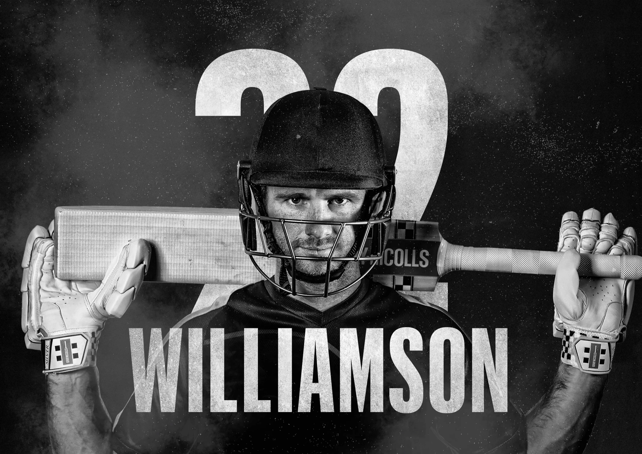
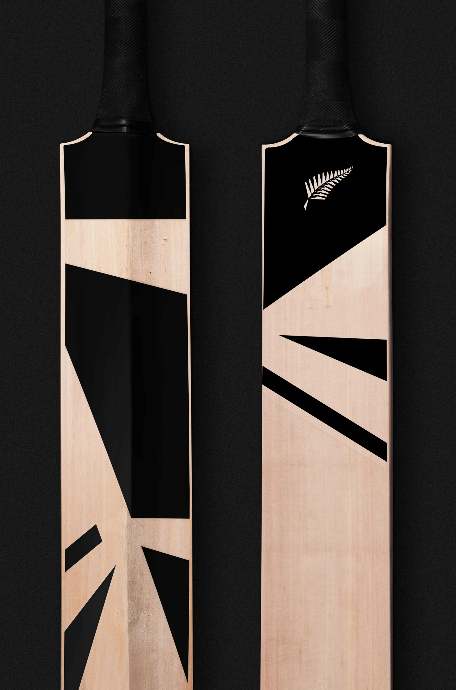
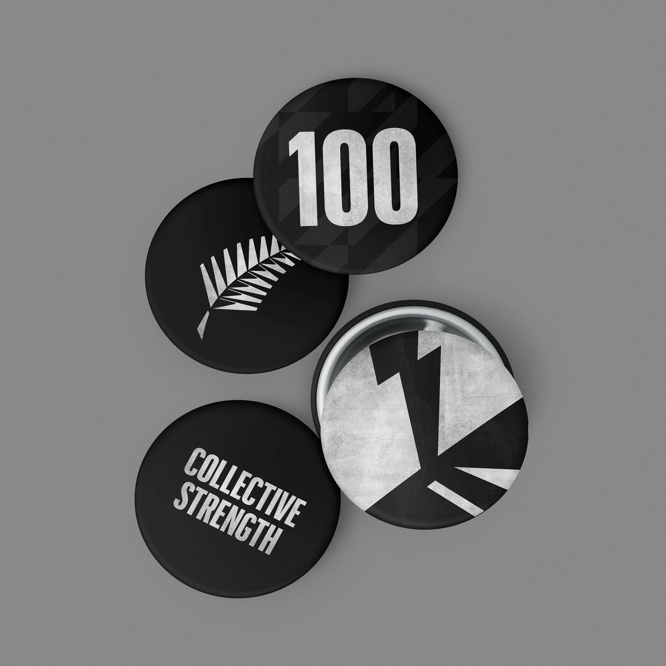
The identity combines the enduring power of the silver fern with a bold, digital-first visual language. Geometric forms, typography, monochrome imagery and layered textures create intensity while retaining a classic sense of national pride. A flexible toolkit enables consistent content across squad announcements, live milestones, match coverage and social channels.






Project Team
Design: Matt Power, Ethan Lowe
Direction: Nick Riley
Animation: Gloria Grimoldi